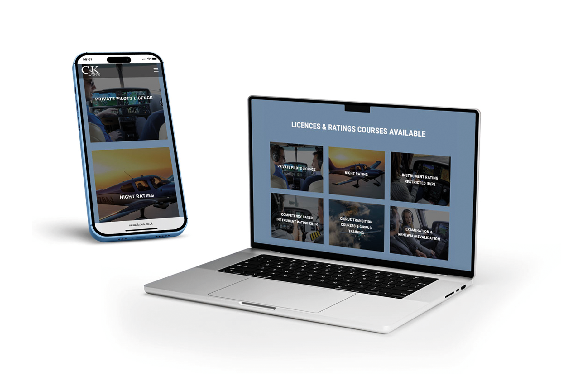
Smart phones and tablets are being used much more for everyday use due to how easy they are to transport around with you and how easily accessible they are. Many of us will choose to look at a website on a smart phone or a tablet because they load up much quicker than a computer or a laptop. They are also easy to use if you want to look at something very quickly. The only disadvantage to this is not every website is mobile responsive which means the website will be displayed in the wrong format for the screen that it is being viewed on.
Some companies may have a website and an App therefore they may feel as though they do not need to have a mobile responsive website when customers can download the App. However not everyone downloads Apps as they prefer to visit the website online as this is something that they are used to using, therefore all websites should be mobile responsive to display the content the correct way on the screen which it is being viewed on.
The Growth of Technology
With the growth of modern technology, websites can be viewed on many different devices all with various screen sizes. You may have one person looking at a website on a smart phone and another person looking at that same site on a 27 inch Apple Mac computer. You need a website which is easy to navigate through whether it is being viewed on a smart phone, a tablet or a computer screen. This is why it is important to have a mobile responsive website so that the website will fit correctly into the size of screen which it is being viewed on.
Smart phones and tablets are taken everywhere. They are used for work purposes as well as for personal use. They can be used instead of a computer as they are easy to take with you wherever you go. People will use their smart phone or tablet for sending work emails throughout the day, to booking that all important holiday in the evening with their partner and sharing this information on social media with their friends and family.
The Disadvantages of an Unresponsive Website
If you’re website is not mobile responsive then your website will appear on a smart phone screen the same way that it does on a computer. The website will be very difficult to use as the user will have to zoom into various areas to be able to see what content is on your website. Links and tabs will be very difficult to click as they will be very small being viewed from a smart phone.
Customers may find that an unresponsive website is too difficult to use on their smart phone or tablet and may choose not to use that website at all. This may lead to them waiting to use a computer to order from that particular website or they may choose a competitor to buy from instead which means you have lost a customer.
Mobile responsive websites which are not built correctly may cause customers to have problems whilst using them. Problems can occur when loading doesn’t work properly and products can not be viewed. Other problems can be at the checkout point where the customer can not complete their order which may frustrate the customer as they have spent time looking for the products they wish to buy. Again this could lead to losing customers. At MGT Design you can be assured that all of our websites are built to high quality standards and problems such as this will not occur.
The Advantages of Mobile Responsive Website
Mobile responsive websites make it easier for customers to view your products and services in a much clearer view. When a website is not mobile responsive then it will appear the same way that it does on a computer, whereas a mobile responsive site will be sized correctly for you to view the content of the website correctly. With a mobile responsive website, content will be reduced to fit the size of the screen which it is being viewed on. For example viewing a clothing website on a computer you will be able to see more products on the screen, such as 8 dresses at once, whereas on a mobile this will be reduced to less products, for example 4 dresses instead of 8 at one time.
Customers will be able to navigate easily through a mobile responsive website and will be able to view products clearly and also be able to see a description of the product. E-commerce websites can easily have a mobile responsive website and customers can easily add the products that they would like to their basket and go through with ordering and making the payment.
MGT Design Mobile Responsive Websites
At MGT Design we make sure that all of our websites are mobile responsive as all websites built in the present day should be mobile responsive so that they will work alongside all current technology from smart phones and tablets through to large computer screens. We also make sure that any photos that are used within the website is off the best quality so that it will look good being viewed on both small and large screens.
We believe that mobile responsive websites are important as they not only benefit the customer, so that the customer can navigate through the website with ease, but they will also benefit the company. This is because customers will be able to view products and services correctly without having to zoom in close to see a blurry picture, instead the customer will see a clear picture of the product with a description of the product in text which you can easily read. This means that the customer is more likely to use your site and is therefore more likely to make a purchase.


